Before & After: Primary Bedroom Renovation
Patsy Cline, the dog not the singer, napping on her favorite bed.
Last week, I showed the before and after pics of the main living space in our attic remodel. This week, it's all about the master bedroom.
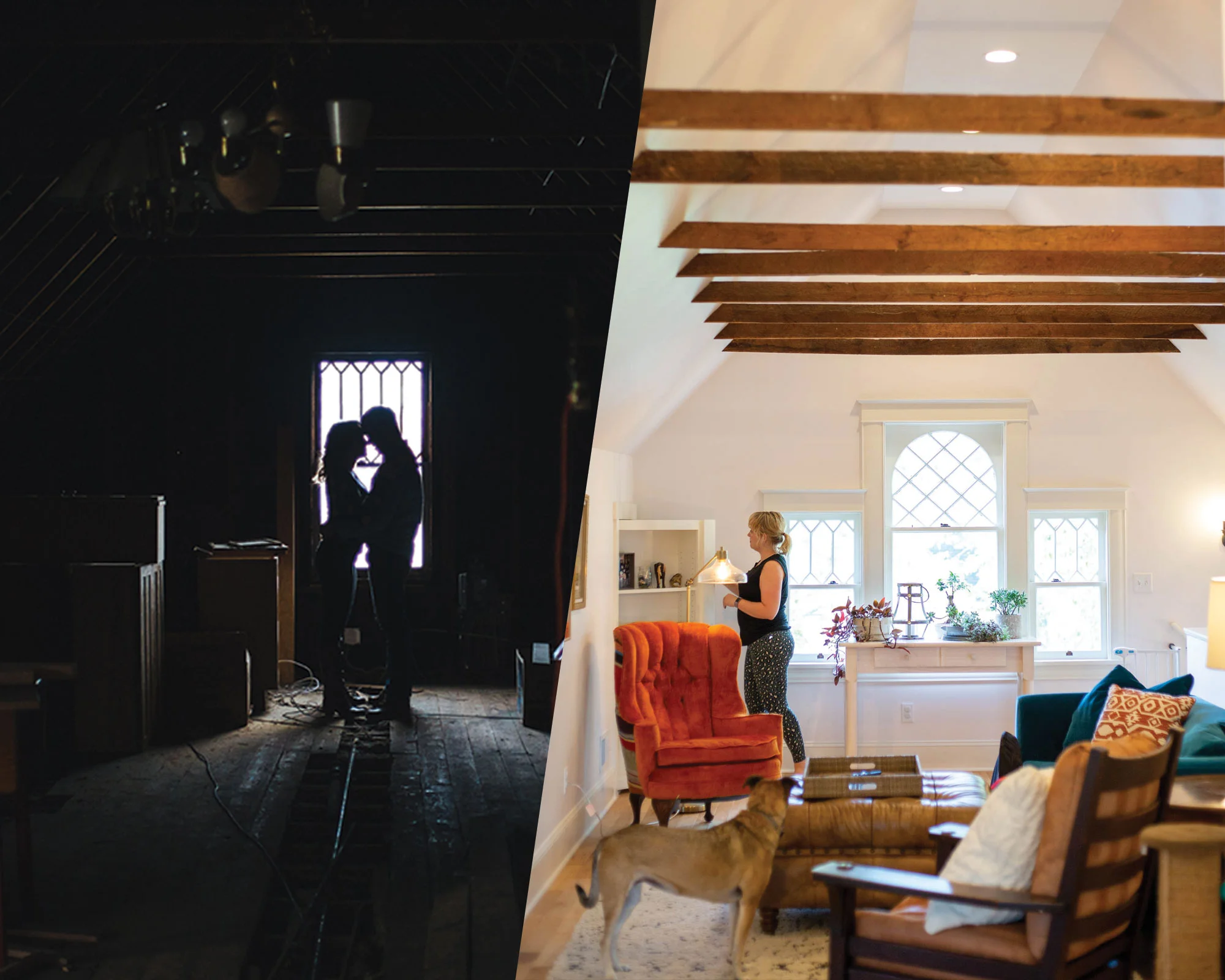
Quick reminder: this is what this spooky-ass space looked like before:
Not creepy at all!
Our bedroom is roughly located in the "room" in the photo on the right.
As I mentioned before, our house in an original duplex (meaning it was built as a duplex, not a single family house later turned into a duplex) in the late 1890s. Apparently, each unit had a bedroom in the attic for their maids. I honestly can't believe anyone ever lived up here. There was a weird old toilet in the basement when we moved in (we've since updated that!), which leads me to believe they had to go down four flights of stairs to pee.
Anyhow, our goal for the bedroom was to make it big enough for a king sized bed.
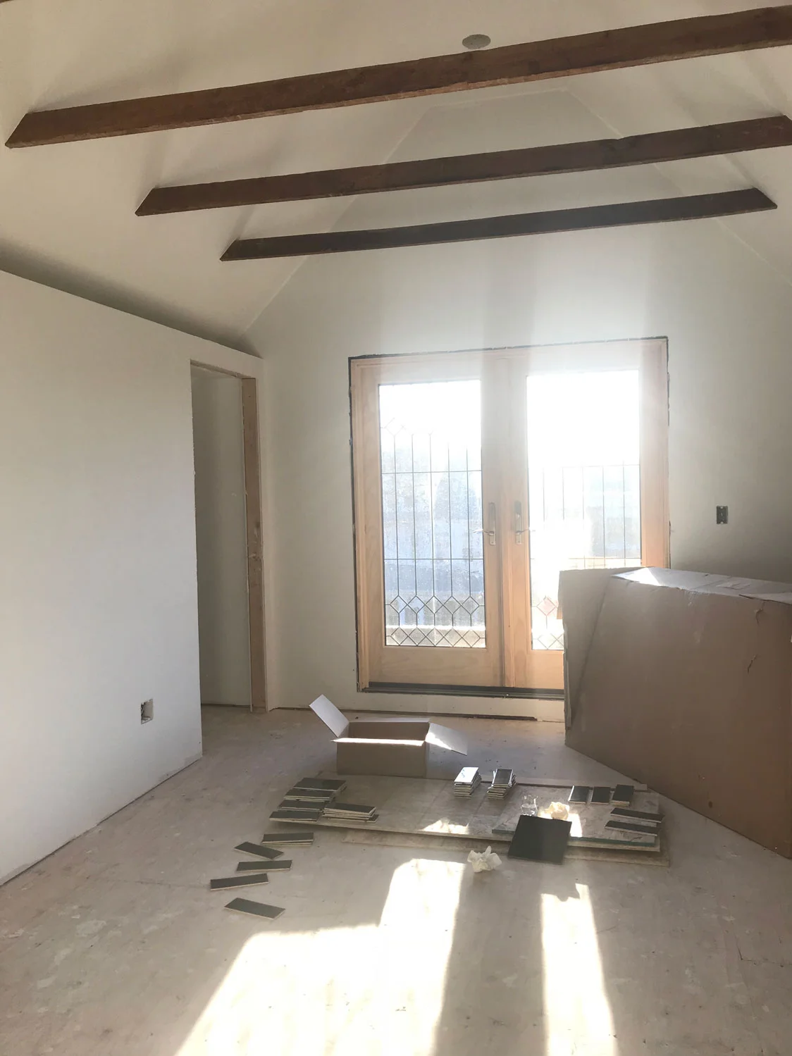
What can I say, I like my space. We also wanted to keep the original beams exposed, and create a deck on the existing flat roof. A reminder-- we moved the original windows that were here to the back of the house, and ended up splurging a bit on these French doors from Anderson windows. They are new and very efficient, but also tie into the home’s era.
Sexy doors from Anderson Windows.
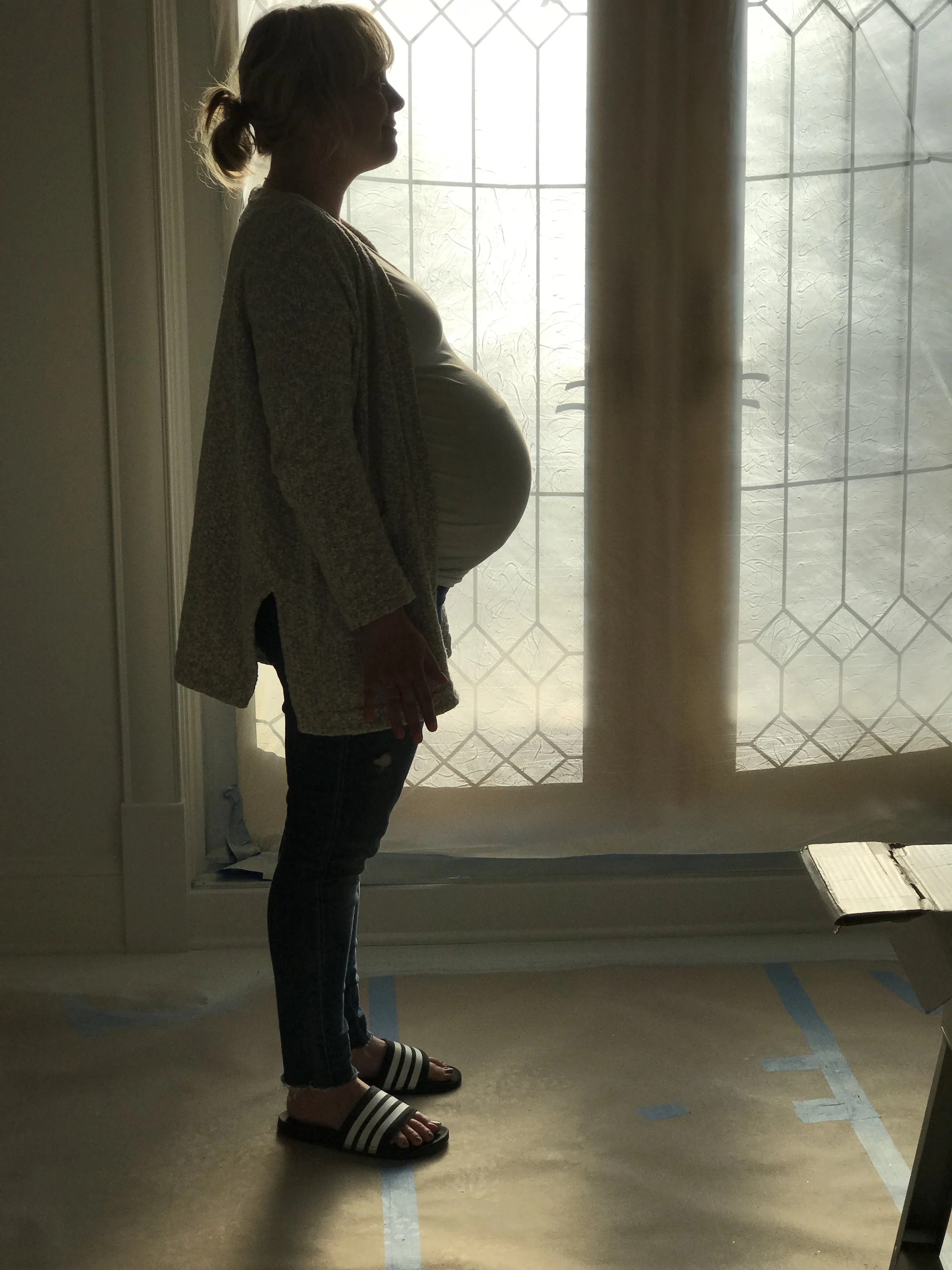
What will come first... the baby or the completion of this renovation?
Custom cabinets built into the knee walls.
The sloped walls created bit of a design conundrum. You want to use some of the space behind the knee walls, but how? We opted to go with a built-in dresser and armoire, which we had custom made. We love the style and function, but maybe would've gone a touch darker for the finish. Oh well— if this was our biggest mistake, I’m not mad about it.
Here's the view from my office/main living space into the new bedroom:
Before and after photos of our Victorian home attic renovation. This is our master bedroom.
We wanted to keep things pretty simple, but also colorful. The duvet cover is from Brooklinen, and the throw is from anthropologie.
We found the green glider on Craigslist, but it's originally from Room & Board. I always liked this chair, which is why I thought I would like the stupid blue couch in the main area. I never knew how much pet hair velvet collected because my cat and dog are too scared to jump on this rocking chair. They have zero problem jumping on the couch. Ugh!
The bed is from Archbold Furniture Co. Two paws up.
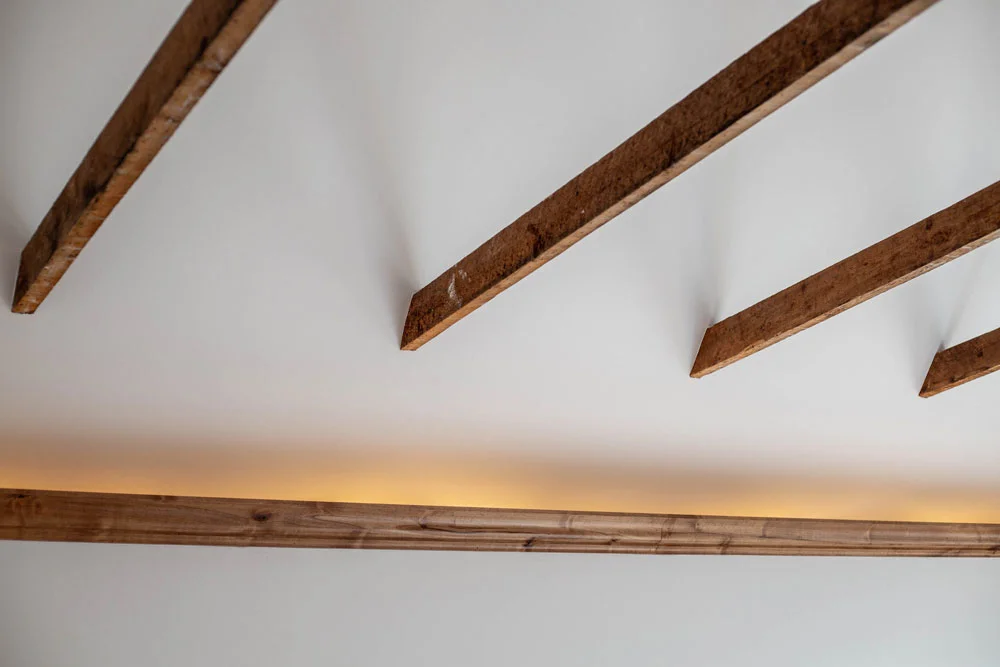
One of the things I love about this space is this lighting. We ended up deciding to create a ledge there because nothing was level up here. Hello, 120-year-old house! When you turn this on in the evening, it's just so cozy.
Mood lighting for the win.
Another great thing about the space? The deck!
We can spy on people walking by, and live the perfect distance from the airport to watch the flight patterns without going deaf from airplane noise. The only downside is that it's scorching hot up here in the afternoon, so I haven't used the deck as much as I'd like.
https://youtu.be/7TF3OO_8ZqM
The renovation wasn't complete until I was literally in the hospital, giving birth to Clark. Even though the project took longer than expected, it was so worth coming home from the hospital to a beautiful, serene, quiet space. One of my favorite memories of all time is our entire family taking a nap in our new bedroom the day after we got home form the hospital. Serious sweetness!
A family nap I will never forget.
ANY QUESTIONS YOU HAVE ABOUT THIS RENOVATION? THAT’S WHAT THE COMMENTS ARE FOR!
Details:
Renovation by Eric Lundquist of Lakeland Construction.
French doors: Anderson Windows
Shag rug: Rugs USA
Bed: Archbold Furniture Co, which we bought at Woody's Furniture.
Glider: Room & Board (we got ours on Craigslist)
Duvet & Sheets: Brooklinen
Throw: anthropologie
Bedside Lamp: Target
The good photos are by Jane Veitenheimer


