Before & After: Primary Bathroom Renovation (w/ Sexy Green Tile)
We live in a hotel now.
Never have I ever had access to a bathroom directly from my bedroom.
Which is fine, I am not the Queen of England, but I have zero problem admitting that I wanted an ensuite bathroom so bad!
I’ve always dreamed of living in a stylish hotel– something clean and cozy, without crap everywhere. And I think this suite is the closest I’ll ever get to that in my life, largely because of this epically spacious bathroom.
Check out this bathroom remodel. Transformation city!
This is my favorite room in the house.
Our attic had two existing dormers, and this bathroom uses up one of them, plus a little extra for our toilet room (or as my friend Madeleine calls it, a “pee closet”). There used to be a small bedroom in the dormer, back from the days where people who lived in duplexes apparently also had live-in maids.
I made Josh take a few of our engagement photos in here six years ago because I thought it had an anthropologie/flophouse vibe. Here’s what the space looked like before:
Isn’t this flophouse romantic? Photo: Jonny Edwin
We had to rip everything out, down to the studs. And let me tell you: plaster is messy and quite heavy. Not that I did any of the demo myself as I was pregnant* at the time.
The drywall was hung around the window with care.
*If I hadn’t been pregnant, I also would not have done any demo.
We weren’t able to salvage the original window, and that ended up being just fine. We currently have a privacy film on our new, energy efficient window in order to avoid awkward incidents with the next door neighbors.
When it all started to come together.
The double vanity was a huge upgrade from the pedestal sink on our first floor. Drawers? In a bathroom?! What a concept!
I know real rugs can be a polarizing thing when it comes to bathroom design– how do you keep them clean? We use a bathmat normally, but it’s not pictured anywhere on this post because bathmats aren’t cute.
One of the things you don’t think about when buying a 120-year-old house (especially a duplex– twice the former residents!) is all the stuff you inherit with it. In our case, there are soooo many doors just laying around our basement! We were able to repurpose a few for this project– two as pocket doors and one as a swinging door into the toilet room.
I’m too sexy for this door. – the door handle
You just don’t find doors with details like this at Home Depot.
Can you believe the detail??? My toddler can’t.
These old doors.
And here’s the best part of this space… the tile.
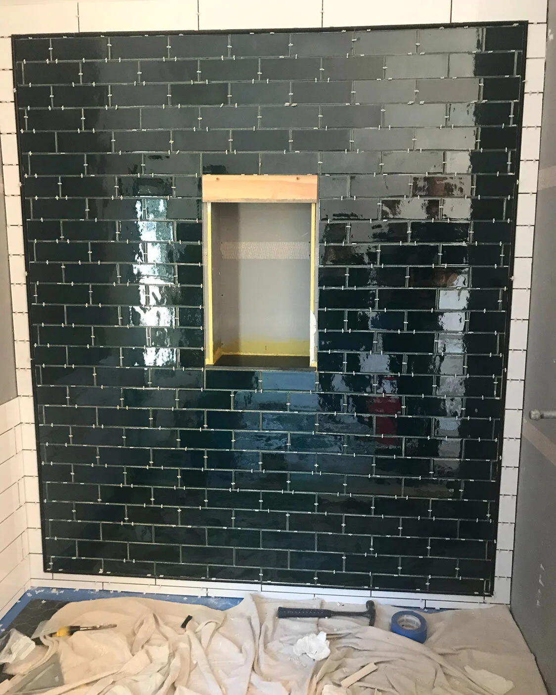
Work in progress.
I’ve been lusting over Mercury Mosaics’ handmade tiles for years. They’re beautiful (and made not only in America, but in Minneapolis!). The thing is, beauty doesn’t come cheap. During this renovation, I’d read somewhere that if you’re doing tile on a budget, it’s best to spend more money on the tile you see– meaning a backsplash or, in this case, a bold shower wall. It’s a small-ish area, but really makes a statement.
Since tiles are handmade, they vary in color and aren’t 100% uniform in shape. Our contractor kind of wanted to murder us after spending three days on this wall, but the finished product sings… don’t you agree?
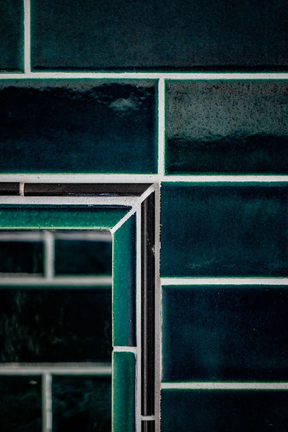
Can you believe that blue/green color?
Not pictured: black bathmat.
We purchased the commercially-made white subway tile, black pencil tile, shower and bathroom floor tile from the Tile Shop, which was more economical but also lovely.
A NOTE ABOUT THE TILE LAYOUT.
Originally, I thought we should just do a solid green wall. I didn’t really have any other ideas. However, two designer friends separately suggested framing the green with a thin, black tile. I could not envision what this would look like, but after hemming and hawing, we decided to go with it. I wanted the bathroom to have more of a vintage vibe. It turned out way better than I ever imagined!
This is a shower for giants.
Pinterest/Instagram will tell you otherwise, but there are other options than gold/brass for fixtures. This one is called “chrome.” Maybe you’ve heard of it.
SOME FUN THINGS WE LEARNED ABOUT TILE:
Look, I clean my shower, but sometimes the white grout gets spots of pink-ish mold. We used light gray for the green tile and shower floor. You can barely tell they’re not white, and are so much easier to keep clean.
We opted for large, white subway tile for the sides of the shower. I was worried that the scale would look weird next to the smaller green tile. In fact, it looks fab AND larger tiles mean less grout, which is easier to clean.
This has nothing to do with tile, but I wanted to keep the walls light. I was thinking white, but ended up doing just a tinge of green. It warms up the space really well!
Can’t even tell the grout is gray, can ya?
Those edges are a sight to behold.
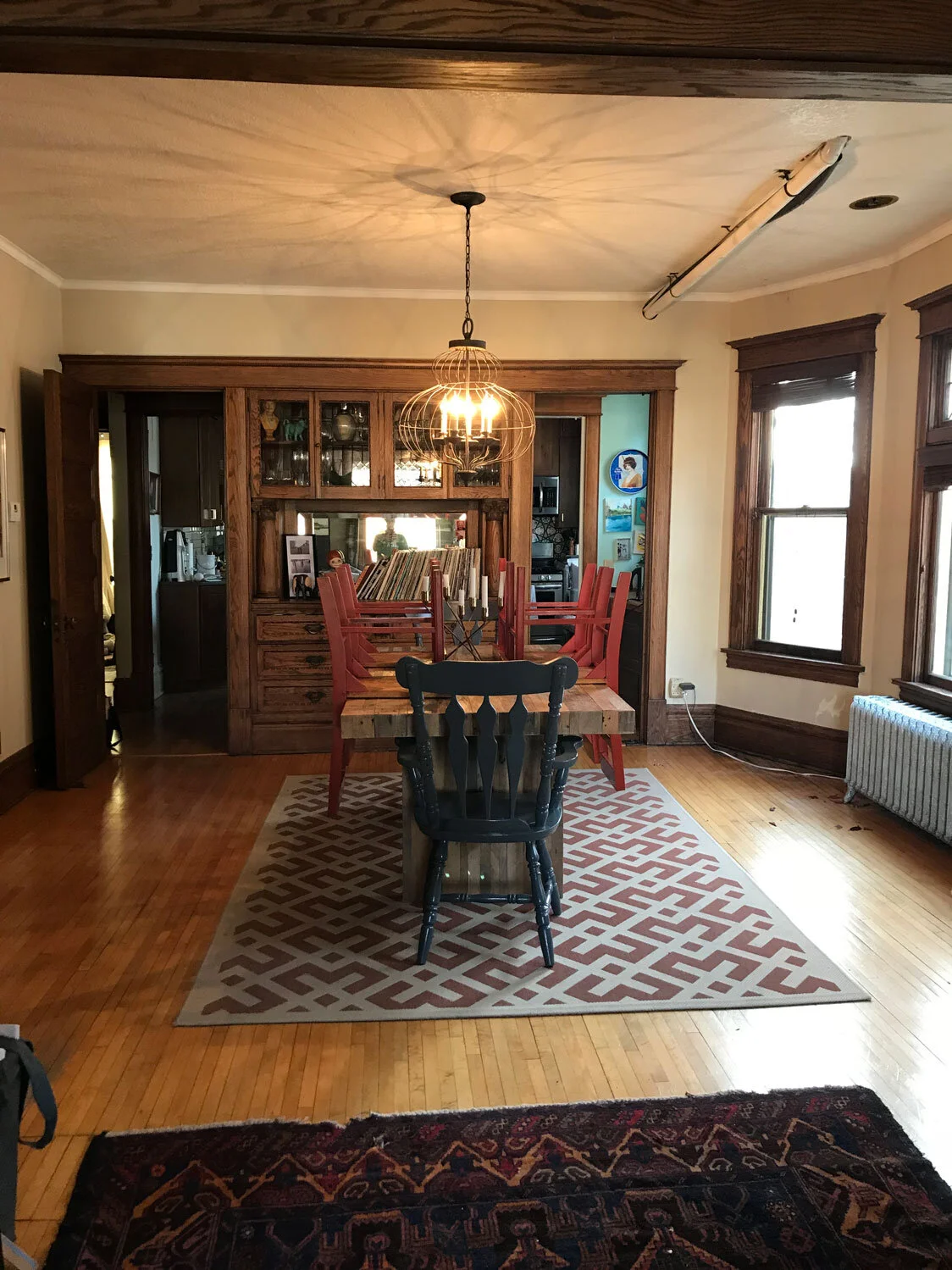
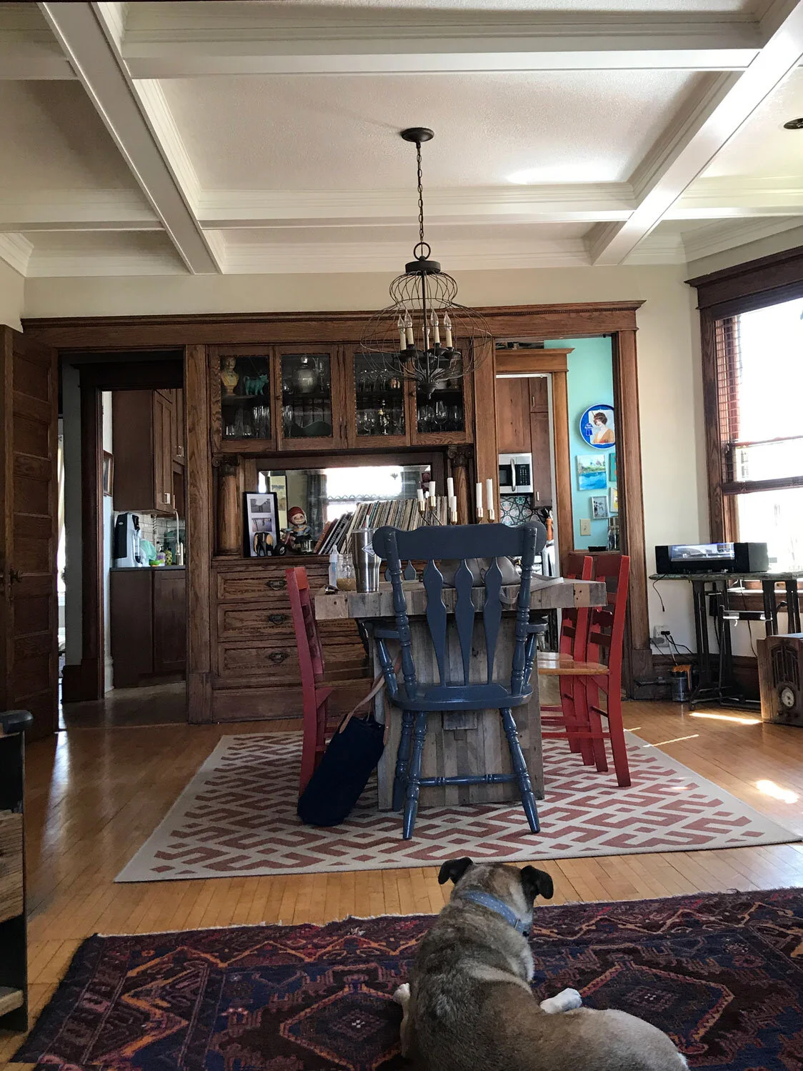
A note about plumbing. Pipes need to run down hill. This was a bit of an issue as nothing was level in the attic. We needed to get creative with the pipes, and our contractor suggested we drop the ceiling in our dining room four inches to accommodate the pipes. Ugh, no one really liked that idea, but it was the best we had.
Exposed is not the way to go.
And then my friend Carter mentioned that we could do a coffered ceiling and run the pipes through one of the beams. It was a bear to build, but look how elegant it turned out! Never has sewage looked so classy.
Can you even believe the transformation? Maybe I AM the Queen of England!
If I’m being totally honest, I wish we’d put in a tub. It was just so hard to imagine we’d have the space for it, but I think we did. Oh well, no renovation is perfect and there’s always the one downstairs, which feels like an oasis once I put all the bath toys away.
Any questions about this renovation? That’s what the comments are for!
Details:
Renovation by Lakeland Contractors
Vanity by Rejuvenation
Chrome vanity hardware from Wayfair
Rug from Etsy
Lights from Wayfair (similar)
Bluegrass subway tile from Mercury Mosaics
Large white subway tile from the Tile Shop (similar)
Small hexagon travertine tile from the Tile Shop (similar)
Large hexagon travertine tile from the Tile Shop
Shower fixtures by Delta Faucet’s Cassidy line
Mirror from Wayfair
Photos by Jane Veitenheimer

